TWR Fitness Website Review - What Went Well and Areas for Improvement
Ever wonder what the difference is between a DIY website and a website made by a professional website designer? Learn common pitfalls most businesses make with their website with this audit of TWR Fitness’s website.
In today’s digital age, a well-designed and optimized website is essential for businesses to succeed online. However, even with the best intentions, many individuals and entrepreneurs fall into common traps when attempting to build their websites themselves. In this blog post, we’ll take you through a detailed website audit performed for TWR Fitness, highlighting the strengths and areas for improvement. Join us as we uncover valuable insights and provide actionable steps to enhance your website’s performance, accessibility, design, and overall effectiveness.
Performance - The Need for Speed
I like to start every website audit with a look at how fast the website loads. There are two numbers that we are looking for, how fast the website loads on a mobile device and how fast it loads on a desktop or laptop.
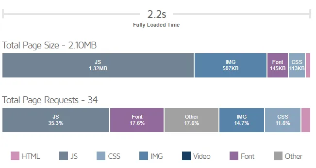
Desktop page load speed - 2.2 seconds
Running a page load speed audit on the website shows that on a desktop the website loads in 2.33 seconds. This is exactly what we are looking for. Anything under 4 seconds is the bare minimum. The closer you can get to 1 second the better.
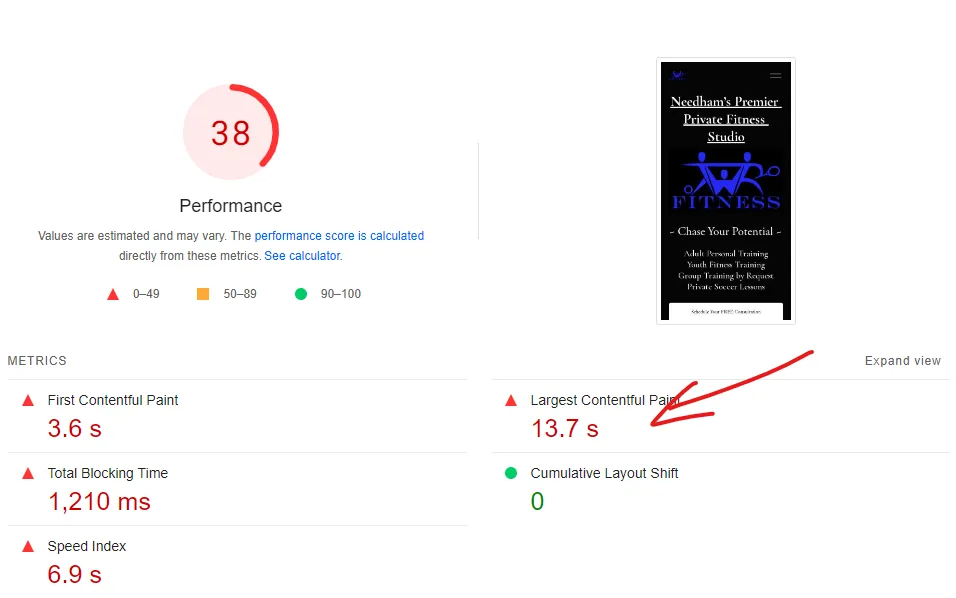
Mobile page load speed - 13.7 seconds
The mobile load speed is a different story. When we run a mobile audit for page load speed we can see the website scores a 38/100 and fully loads in around 13.7 seconds. More than half of all website traffic today comes from mobile devices ( Statista ). 13 seconds may have been back when we had dial-up, but in today’s world your slow loading website will scare customers away to your competition.
Now I can tell that this website was built on Squarespace and unfortunately that means there isn’t really anything that can bee done to improve the page speed. DIY builders like Squarespace come with bloat since they need to load more code than is necessary. They load everything that you might need and not what you actually need.
Maximize Your Google Business Profile
Tristan mentioned to me that one of his focuses is getting more traffic to his website. A simple method to strengthen your business is to create a Google Business Profile. Let’s take a look at what TWR Fitness does well and what could be improved here.
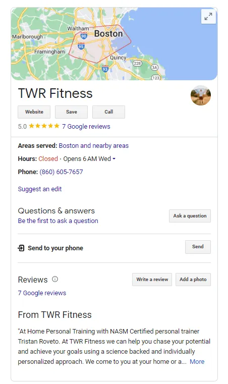
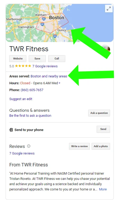
TWR Fitness Google Business Profile
Starting with the positives. Tristan has 7 five star reviews. Positive reviews can make a huge difference when it comes time for Google to recommend one business over another. Aside from the reviews, the profile features a number, a link to the website, business hours, and an explanation about what the business does. This all makes for a solid start to the profile.
Let’s make it even better.
Narrow down the location
Currently, the profile does not have an address. This means that customers can’t click “directions”. This also means that Google doesn’t know where you are specifically, so when people search for “personal trainers near me” it won’t know where you are, so it is less likely to recommend you. Fix this by setting your physical location. Currently, the profile does not have an address. This means that customers can’t click “directions”. This also means that Google doesn’t know where you are specifically, so when people search for “personal trainers near me” it won’t know where you are, so it is less likely to recommend you. Fix this by setting your physical location.
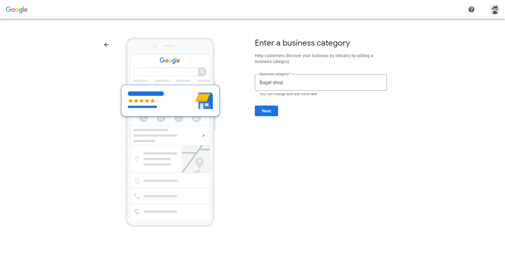
Enter a business category
On the note of “searching for personal trainers near me”, the profile currently doesn’t have a business category selected. Choosing a business category tells Google how to classify your business and helps it make recommendations. By not including a business category you are making Google’s job more difficult to recommend to you.
Once these changes have been made, keep asking your clients for reviews to keep building your authority in Google’s eyes.
Don't Have A Google Business Profile?
Follow our step-by-step tutorial and learn how to set up your Google Business Profile in less than 10 minutes.
Set Up Your Google Business ProfileSecurity Measures for Peace of Mind
Security is often an afterthought for more business owners and it shouldn’t be. I have seen websites hacked and accidentally deleted. A strong security plan can both prevent the headache of website hack and have a backup plan should something go wrong.
Check for SSL Certificate
The lock shows a SSL certificate
Have you ever noticed the little checkmark next to the address of a website? That’s called an SSL certificate. SSL certificates serve two important roles. They encrypt the connection between a visitor and your website. This helps keep any data that is being transferred protected. They also help verify that your website isn’t pretending to be someone else.
Both are important for building trust. Search engines like Google will consider how safe your website is before recommending so it’s important that your website has this.
Enable Two Factor Authentication
Make your website as difficult to hack by enabling two factor authentication. Without it you put your website at greater risk of being hacked.
Create a Backup Plan
Hope for the best, plan for the worst. Website’s need to be backed up periodically. In the event that your website is hacked a website backup means you don’t need to start from scratch. Again, since this website is on Squarespace you are relying on their backup system, whatever that might be.
Consider Website Accessibility
Website accessibility is another key consideration often overlooked. Just like physical store locations, websites are required by law to be accessible. Failure to do so can result in hefty fines (User Way).
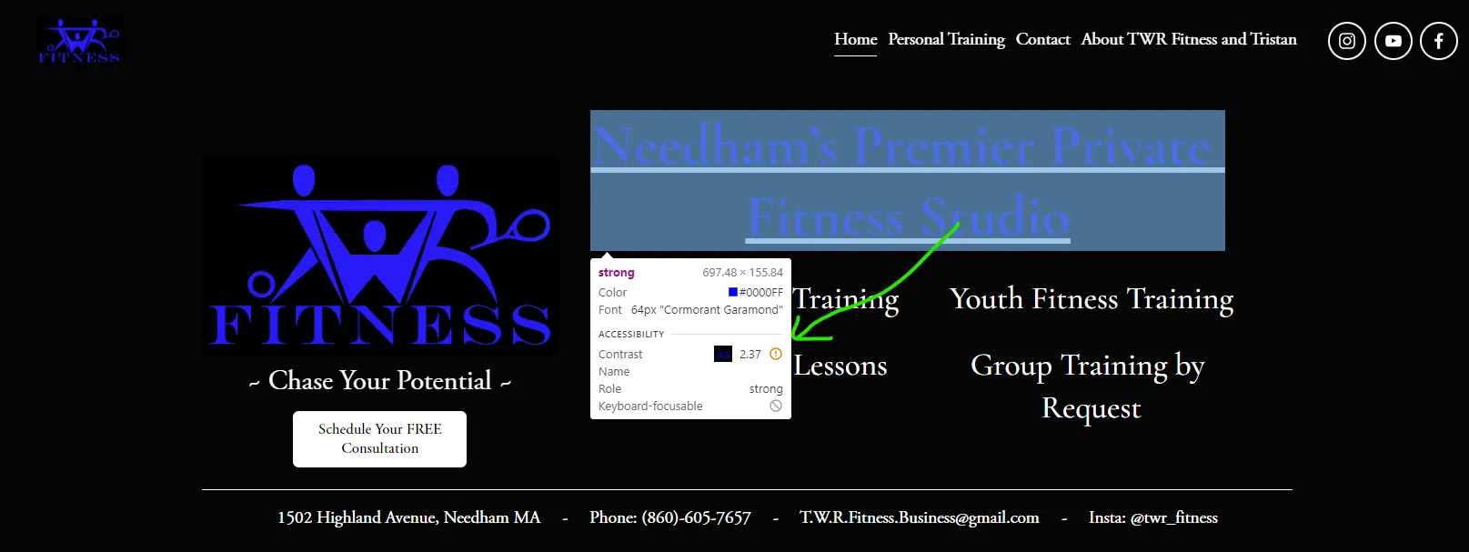
Black and blue is hard to see
When we look at the page we can see that the headline text is black and blue. If we inspect the blue text over the black background we can see that it says the contrast is 2.5 and there is an exclamation mark. The reason being is that certain individuals won’t be able to see the difference between those two colors enough to actually read the text.
This is a relatively simple fix, just make sure that the text on your website is easy to read. You can do that either by changing the background or changing the logo color either way.
Speak Your Customer’s Language
The next step is the next quality of a good website that we’re looking for is if it speaks the language of its customers. We don’t want to forget that the main way to sell, especially on a website, is to talk about results and then the obstacles that are in the way.
We want to on the one hand explain the results that your customers are getting. Make these results prominent and hype them up. Be genuine and share what those results are.
On the other hand, you want to reduce objections and make it hard to say no. This way website visitors will be able to quickly understand why your business is the best option to get them the result they want.
Let’s review the homepage. You get a little bit into why training is beneficial, which is good. You also have some testimonials which are great because that shows social proof and eliminates the fear that you won’t be able to help them.
But to strengthen the page, you really want to just dedicate some sections to talk about the benefits. Just outline them, whatever the main benefits are. Already you talk about how customers can expect increased energy. Elaborate on this and find more reasons that matter to them
Adding any physical transformations would take social proof to the next level. Before and after could even be, you’re talking youth fitness success stories with people that have started working with you and now have achieved great things in their soccer career or whatever that is. Those are all good sections to add to your website, even pages to add to your website.
Make it Easy for Search Engines to Recommend You
How can we optimize our website to show up in search engines? The one thing you wanna start with is the keywords.
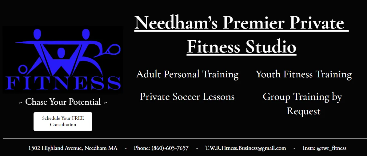
Homepage hero section
So right here, the largest text, Needham’s premier private gym, this is something that you’re going to want to decide on. How do you want people to find you? Including the location, Needham, is a strong start. Including “premier private fitness studio” tells Google what it is you are and what you do. This way they will try to connect what people are searching for with what it is you say you are..
Competing at SEO can be a challenging and time consuming task especially when you’re competing at a high level and going for that number one rank spot, since you will be competing against all of Boston. Instead you will want to primarily focus on local SEO. So you’re not gonna be competing with all of Boston, you’re not gonna be competing with all of Massachusetts. You’re gonna be competing specifically to the area where people are willing to drive to you or that you’re willing to drive to.
Focus on Local SEO
Local SEO ends up being a bit different game than normal SEO. Local SEO is all about getting reviews. If you can get as many reviews as possible, and they have to be genuine, you can’t just pay people to get reviews. That’s gonna be a signal to Google that you’re doing a good job.
Adding in that physical address to your Google Business Profile, as we talked about earlier, will also be beneficial. Soon Google will start recognizing your specific location. And then in that specific location, you’ll start showing up higher and higher. Because right now you’re dealing with everyone that’s related to the fitness industry across all of Boston, and some people have more reviews than you. Some people have been doing more and spending more time on SEO. Some people have a website that loads faster than you. Some people have a website where people spend more time on it, so you’re competing with a lot of people in this big area. There are probably 4 million people, and then however many gyms. You are currently competing with all these gyms.
Find Website Links
One idea you can use to build more credibility for your website is to see if you can get a writeup and a link to your website from a local newspaper in Needham. Links to your website are like little votes from other websites that show Google you can be trusted.
Design and Structure Recommendations
Next, let’s discuss general design and structure recommendations.
Create a Pronounced Footer
From a design perspective, each section should be clear and distinct. Users associate the top of a webpage with navigation, where they find menus and important links. On the other hand, the bottom – the footer – is often associated with general information, including contact details and supplementary links.
No separation between content and footer
Highlight Contact information
A well-crafted footer can be a valuable tool for providing essential contact information to your visitors. In TWR Fitness’s case, we recommend adding the physical address prominently. Not only does this assist visitors in locating your business, but it also signals to search engines like Google that your business has a physical presence, which can positively impact local search rankings.
Ensure Consistency with Google Business Profile
Consistency is key in creating a seamless user experience. Ensure that the operating hours listed in the footer align with the details on your Google My Business profile. Mismatched information can lead to confusion and potentially deter potential customers.
Consider a Professional Email Address
While the existing email is good, you might want to consider setting up a dedicated business email. Platforms like Squarespace offer the capability to create a custom email address (e.g., [email protected]), which adds a professional touch to your communication. A business email can enhance your brand’s credibility and trustworthiness.
Simplify the First Impression
First impressions are crucial for any website. The average visitor will spend less than a minute on your website (HubSpot) so it is crucial that your first impression doesn’t scare any customers away.
Too much going on or first impression
Streamline Top Navigation
The header of your website serves as a roadmap for visitors, guiding them to key areas of interest. We recommend refining the header navigation by strategically organizing the pages. The optimal sequence, from left to right, would be: Home, About, Services, Contact, and Call to Action (which we’ll discuss shortly). This streamlined layout ensures easy navigation and quick access to essential information. Social media links should be placed in the footer to avoid creating visual noise/clutter.
Create a Focused Hero Section
Your hero section should not have information that should be in the footer. Remover the address, phone, email, and social links. Instead the hero section should aim to have the following:
- A headline that makes a captivating claim.
- A small sub-headline that states what it is you do.
- A short paragraph providing more details as to what you do and why the visitor should care.
- An image that is relevant to the end result you offer.
- A call to action with a distinct promise.
Drive Action with Compelling Call-to-Actions: The Key to More Consultations
In our ongoing exploration of website optimization for TWR Fitness, we arrive at what could be the most impactful aspect of all – crafting compelling call-to-actions (CTAs). If your ultimate goal is to boost consultations, your website must guide visitors seamlessly toward this desired outcome. Let’s dive into the art of creating effective CTAs that resonate with your audience and encourage action.
No CTAs Hurt Your Website
The absence of clear CTAs on your website can lead to missed opportunities for engagement. While a faint “Learn More” button exists, it’s the strategic placement and wording of CTAs that truly drive user interaction. Specifically, for those considering working with you, the next logical step is often a consultation. The CTA should reflect this, inviting visitors to take that crucial step.
Craft Intriguing CTAs
The language you use in your CTAs can make all the difference. Imagine you’re a specialist in Beachside renovations – would a button saying “Schedule Your Consultation” be as impactful as “Unlock Your Dream Beach Home: Request Your Free Renovation Plan”? By including the unique benefits, you create an emotional connection that resonates with visitors and captures their attention.
Not Everyone is Ready: A CTA for Every Visitor
Not every visitor is prepared for a full-fledged consultation. Some might be newcomers learning about your services for the first time. For this audience, a different type of CTA is essential. Consider incorporating a short, informative video that offers quick insights – something they can digest in a day. Just as a general contractor might offer “Seven Questions for Your Dream Renovation,” your video could be “Discover the Seven Stretches for a More Energized Morning.” This provides value, establishes your authority, and encourages visitors to take that first step toward engagement.
Collect User Details With Forms
Once your visitors are motivated to take action, they need something to do. A simple way to collect user interest is with a form. For consultation requests, position a prominent CTA button at the top that leads to a dedicated form. The form should capture necessary details while being user-friendly. And for those interested in the informative video, ensure a separate section on your website houses this content. This helps maintain a clear and organized user journey.
Conclusion: A Path Forward
This website audit for TWR Fitness hopefully sheds light on the common pitfalls that can plague DIY website design. By addressing performance, maximizing Google My Business, enhancing accessibility, speaking the language of customers, optimizing for SEO, refining design and structure, and implementing effective CTAs, businesses can create a more impactful online presence.
Request Your Website Review!
Request your FREE website review and receive a custom 15 minute long video detailing actionable steps you can take to improve your website. Your first step to more visibility, customers, and time.
Request My FREE Website Review